抽屉组件SlidingDrawer的实现,自定义View的配置和实用
利用抽屉内的空间,设置小抽屉来存放微波炉配件,如餐盘和餐具。 #生活技巧# #居家生活技巧# #收纳整理建议# #厨房抽屉整理#
SlidingDrawer可以实现抽屉组件的功能,但有局限性,只支持从右向左打开或从下向上打开抽屉
这个抽屉组件在使用时,需要由两部分组成:
1) 抽屉内容(Content)
2) 抽屉把手(Handle):一般使用一张图片来处理。
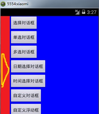
效果图:
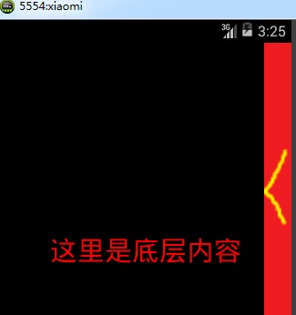
编写一个布局,完成抽屉组件的显示:activity_main.xml
<RelativeLayout xmlns:android="http://schemas.android.com/apk/res/android"
xmlns:tools="http://schemas.android.com/tools"
android:layout_width="match_parent"
android:layout_height="match_parent" >
<TextView
android:layout_width="match_parent"
android:layout_height="match_parent"
android:gravity="center"
android:text="这里是底层内容"
android:textColor="#ff0000"
android:textSize="30sp" />
<SlidingDrawer
android:id="@+id/sliding"
android:layout_width="match_parent"
android:layout_height="match_parent"
android:content="@+id/content"
android:handle="@+id/handle_img"
android:orientation="horizontal" >
<ImageView
android:id="@id/handle_img"
android:layout_width="30dp"
android:layout_height="800dp"
android:src="@drawable/show" />
<LinearLayout
android:id="@id/content"
android:background="#0000ff"
android:layout_width="match_parent"
android:layout_height="match_parent"
android:orientation="vertical" >
<Button
android:id="@+id/select_btn"
android:layout_width="wrap_content"
android:layout_height="wrap_content"
android:text="选择对话框" />
<Button
android:id="@+id/radio_btn"
android:layout_width="wrap_content"
android:layout_height="wrap_content"
android:text="单选对话框" />
<Button
android:id="@+id/checkbox_btn"
android:layout_width="wrap_content"
android:layout_height="wrap_content"
android:text="多选对话框" />
<Button
android:id="@+id/date_btn"
android:layout_width="wrap_content"
android:layout_height="wrap_content"
android:text="日期选择对话框" />
<Button
android:id="@+id/time_btn"
android:layout_width="wrap_content"
android:layout_height="wrap_content"
android:text="时间选择对话框" />
<Button
android:id="@+id/my_btn"
android:layout_width="wrap_content"
android:layout_height="wrap_content"
android:text="自定义对话框" />
<Button
android:id="@+id/toast_btn"
android:layout_width="wrap_content"
android:layout_height="wrap_content"
android:text="自定义浮动框" />
</LinearLayout>
</SlidingDrawer>
</RelativeLayout>
//SlidingDrawer也要设置方向,水平方向就是从右向左,垂直方向就是从下向上
可以加入监听,控制SlidingDrawer中的Handle图片的切换。
private SlidingDrawer drawer;
private ImageView handleImg;
drawer = (SlidingDrawer)findViewById(R.id.sliding);
handleImg = (ImageView) findViewById(R.id.handle_img);
drawer.setOnDrawerOpenListener(newOnDrawerOpenListener() {
@Override
public void onDrawerOpened() {
handleImg.setImageResource(R.drawable.hide);
}
});
drawer.setOnDrawerCloseListener(new OnDrawerCloseListener() {
@Override
public void onDrawerClosed() {
handleImg.setImageResource(R.drawable.show);
}
});
抽屉组件功能实现;-------------------------------------------------------------------------------------------------------------------
自定义View的配置和使用:自定义View就是开发人员自行开发一个组件,可以自由控制组件实现的功能,在99%的游戏中,和很多大型的应用中都会用到自定义View。
编写自定义的View时,必须继承一个View的类,并覆写onDraw方法。
onDraw方法中提供了绘制当前组件内部的所有内容的功能。
同时还要覆写构造方法。
一般的自定义组件都要加入onTouchListener触屏监听。
一、建立一个自定义的组件,并完成一些简单的绘制操作。
public class MyView extends View {
public MyView(Context context) {
super(context);
}
public MyView(Context context, AttributeSet attrs) {
super(context, attrs);
}
public MyView(Context context, AttributeSet attrs, int defStyle) {
super(context, attrs, defStyle);
}
// 绘制组件中的具体内容
@Override
protected void onDraw(Canvascanvas) {
// 先清空之前绘制的所有内容.
super.onDraw(canvas);
// 建立绘制参数对象
Paint paint = new Paint();
// 通过该对象设置绘制的颜色,文字大小,填充状态等信息
paint.setTextSize(20);
paint.setColor(Color.RED);
// 绘制一些内容
// 绘制文字
canvas.drawText("测试信息", 100, 50, paint);
// 切换新的颜色
paint.setColor(Color.GREEN);
// 绘制线
canvas.drawLine(50, 100, 100, 200, paint);
// 设置绘制的形式,以及颜色
paint.setColor(Color.BLUE);
paint.setStyle(Style.FILL_AND_STROKE);
// 绘制图形
canvas.drawRect(100, 400, 300, 500,paint);
// 绘制已有的图片
canvas.drawBitmap(BitmapFactory.decodeResource(getResources(),
R.drawable.close_dir), 100, 600, paint);
}
}
二、创建配置实用
<RelativeLayout xmlns:android="http://schemas.android.com/apk/res/android"
xmlns:tools="http://schemas.android.com/tools"
android:layout_width="match_parent"
android:layout_height="match_parent"
android:background="#ffffff">
<org.liky.first.view.MyView
android:id="@+id/my_view"
android:layout_width="match_parent"
android:layout_height="match_parent">
</org.liky.first.view.MyView>
</RelativeLayout>
网址:抽屉组件SlidingDrawer的实现,自定义View的配置和实用 https://www.yuejiaxmz.com/news/view/1378472
相关内容
抽屉组件SlidingDrawerandroid 隐式抽屉组件(SlidingDrawer)
Android 组件的抽屉(初级)
Vue文档中的抽屉组件实现方法Vue.js
抽屉组件及其安装配件.pdf
JavaScript实现的抽屉组件
使用抽屉分隔器,保持衣物和小配件的有序排列。
抽屉组件
橱柜拉篮还是抽屉实用!橱柜内配置中拉篮和抽屉哪个更实用
适用于结实耐用抽屉系统的定制储物抽屉 来自 K2
随便看看
最新动态分享
- 清洁卫生间应该使用哪些清洁剂?2026实测:配方科学加持,公认清洁抑菌效果好
- 告别异味!家庭必备厕所清洁剂大揭秘
- 生活用品中厕所清洁剂的pH=1,厨房清洁剂的pH=12,下列说法不正确的是()
- 焕新你的浴室:老管家浴室清洁剂,让清洁变得轻松愉快!
- 一瓶搞定全屋:2026年多功能清洁剂深度评测与选购指南
- 女子混用清洁剂致氯气中毒!医生提醒:这些别混用
- 让浴室焕然一新:花王浴室清洁剂的清洁魔法
- 硬核影视指南
- DeepAI全能助手app
- 【免费下载】 太极神器:你的全能生活助手
热点动态分享
- 143005
- 43121
- 41328
- 38544
- 34841
- 26801
- 23035
- 22798
- 18860
- 16700