xaml中VisualState的使用
耳机使用中的充电宝使用注意事项 #生活技巧# #数码产品使用技巧# #耳机使用心得#
原文网址:http://www.cnblogs.com/jason_zhou/archive/2012/06/12/2546485.html
VisualStateManager用于管理控件的状态以及用于状态过渡的逻辑,一般放在controltemplate里面。
xmal中:
< templateRoot >
< VisualStateManager.VisualStateGroups >
oneOrMoreVisualStateGroups
</ VisualStateManager.VisualStateGroups >
</ templateRoot >
一个<VisualStateManager>的结构如下:
------------------------------------------------------------------------------------------------------------------------------------
<VisualStateManager.VisualStateGroups> 状态组组合
<VisualStateGroup> 设置单个的状态组
<VisualStateGroup.Transitions> 设置单个的状态组里不同状态切换时的动画时间
<VisualState> 设置单个的状态的动画效果
</VisualStateGroup>
</VisualStateManager.VisualStateGroups>
-------------------------------------------------------------------------------------------------------------------------------------
以下的例子创建了一个VisualStateManager,里面包含了3种状态情形(VisualState:Normal,Mouseover,Pressed)
此外创建了一个button引用这个,当鼠标放在这个button上时,button会变大,当鼠标按下这个button时,button颜色会改变
xmal中:
代码
< UserControl x:Class ="VisualStateManager_Sample.MainPage"
xmlns ="http://schemas.microsoft.com/winfx/2006/xaml/presentation"
xmlns:x ="http://schemas.microsoft.com/winfx/2006/xaml"
xmlns:d ="http://schemas.microsoft.com/expression/blend/2008"
xmlns:mc ="http://schemas.openxmlformats.org/markup-compatibility/2006"
mc:Ignorable ="d"
d:DesignHeight ="300" d:DesignWidth ="400" > < Grid x:Name ="LayoutRoot" Background ="White" >
< Grid.Resources >
<!-- Style-包含-ControlTemplate- 包含-VisualStateManager -->
< Style x:Key ="ButtonTemplate" TargetType ="Button" >
< Setter Property ="Template" >
< Setter.Value >
< ControlTemplate TargetType ="Button" >
<!--设置控件的Width,Height,Opacity,BorderThickness -->
< Border x:Name ="Button_RootElement" Width ="500" Height ="100" Opacity ="1" BorderThickness ="2" >
< VisualStateManager.VisualStateGroups >
<!-- VisualStateGroup - 视觉状态组,包含CommonStates和FocusStates
CommonStates 包括: Normal, MouseOver, Pressed, Disabled四个VisualState
FocusStates 包括: Unfocused, Focused两个VisualState --> < VisualStateGroup x:Name ="CommonStates" > <!-- 设置视觉状态组改变时的动画时间 -->
< VisualStateGroup.Transitions >
<!-- Take 0.3 second from Normal state to trasition to the MouseOver state. -->
< VisualTransition From ="Normal" To ="MouseOver" GeneratedDuration ="0:0:0.3" /> <!-- Take 0.2 second from MouseOver state to trasition to the Normal state. -->
< VisualTransition From ="MouseOver" To ="Normal" GeneratedDuration ="0:0:0.2" /> <!-- Take 0.2 second from MouseOver state to trasition to the Pressed state. -->
< VisualTransition From ="MouseOver" To ="Pressed" GeneratedDuration ="0:0:0.2" /> <!-- Take 0.2 second from Pressed state to trasition to the MouseOver state. -->
< VisualTransition From ="Pressed" To ="MouseOver" GeneratedDuration ="0:0:0.2" /> </ VisualStateGroup.Transitions > <!-- 3个VisualState,第一个VisualState为Normal -->
< VisualState x:Name ="Normal" />
<!-- Change the button Width and Height when the mouse is over the button.
分别设置Button_RootElement下的Width和Height属性,鼠标放在button上时,button会变大 -->
< VisualState x:Name ="MouseOver" >
< Storyboard >
< DoubleAnimation Storyboard.TargetName ="Button_RootElement"
Storyboard.TargetProperty ="Width" To ="600" />
< DoubleAnimation Storyboard.TargetName ="Button_RootElement"
Storyboard.TargetProperty ="Height" To ="120" />
</ Storyboard >
</ VisualState > <!-- Change the BackgroundBrush背景色, BackgroundBrush边框色, Opacity when the button is pressed. -->
< VisualState x:Name ="Pressed" >
< Storyboard >
< DoubleAnimation Storyboard.TargetName ="Button_RootElement"
Storyboard.TargetProperty ="Opacity" To ="0.8" />
< ColorAnimation Storyboard.TargetName ="BackgroundBrush"
Storyboard.TargetProperty ="Color" To ="LightSkyBlue" />
< ColorAnimation Storyboard.TargetName ="BorderBrush"
Storyboard.TargetProperty ="Color" To ="Blue" />
</ Storyboard >
</ VisualState > </ VisualStateGroup >
</ VisualStateManager.VisualStateGroups > <!-- 内容设置. -->
< ContentPresenter
HorizontalAlignment =" {TemplateBinding HorizontalContentAlignment} "
VerticalAlignment =" {TemplateBinding VerticalContentAlignment} " />
<!-- 背景色设置. -->
< Border.Background >
< SolidColorBrush x:Name ="BackgroundBrush" Color ="Gray" />
</ Border.Background >
<!-- 边框颜色设置. -->
< Border.BorderBrush >
< SolidColorBrush x:Name ="BorderBrush" Color ="Black" />
</ Border.BorderBrush > </ Border >
</ ControlTemplate >
</ Setter.Value >
</ Setter >
</ Style >
</ Grid.Resources >
<!-- button引用ButtonTemplate模板. -->
< Button Style =" {StaticResource ButtonTemplate} "
HorizontalAlignment ="Center" VerticalAlignment ="Center"
Content ="I'm a Button" /> </ Grid >
</ UserControl >
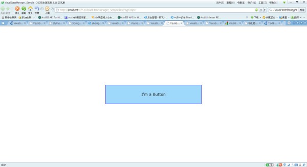
界面如下(由于是截屏,鼠标不可见)
1)button初始化时

2)鼠标在button时

3)当鼠标点击时
网址:xaml中VisualState的使用 https://www.yuejiaxmz.com/news/view/540154
相关内容
MVVM中轻松实现Command绑定(三)任意事件的CommandResourceDictionary.Source 属性
WPF基础(十九)x:key、x:name、name的区别?
WPF 用装饰器制作抽屉效果
个人生活小助手设计 毕业论文.docx
WPF控件与布局详解
【WPF学习手记】制作二维码和条形码
quartz 中JobExecutionContext的使用
shell 中的EOF使用
python中使用
随便看看
最新动态分享
- 只二(正品二手买卖平台)安卓版下载
- 二手衣物交易平台推荐 | 时尚平台必看,助力循环经济
- 毕业季闲置物品如何处理?记者调查
- 2026毕设ssm+vue基于的校园闲置交易分享平台论文+程序
- 智享校园:LBS 技术驱动下的校园闲置循环新样本
- 其他本地服务电话
- 大众生活网
- 专访B站up主芥末 | 现代人美好生活指南 多尝试 赶紧做!
- 硬曲蹭蹭蹭蹭蹭蹭蹭
- 現代修行生活指南
热点动态分享
- 144930
- 50628
- 44879
- 42278
- 40677
- 30746
- 25358
- 25321
- 21737
- 18439